I decided I want to get slightly better at graphic design before returning to Sandia. I think being able to make good graphics/presentation materials is often more important than the results themselves. Plus, it was fun to be slightly creative and was a nice side project to keep me busy. Also, I wanted to make some homemade decorations for my new apartment.
Also, I got to enjoy using the SCD Shop before graduating. It was good; the people there were very friendly and experienced with the various tools.
I ordered three frames from Amazon, so I designed three posters.
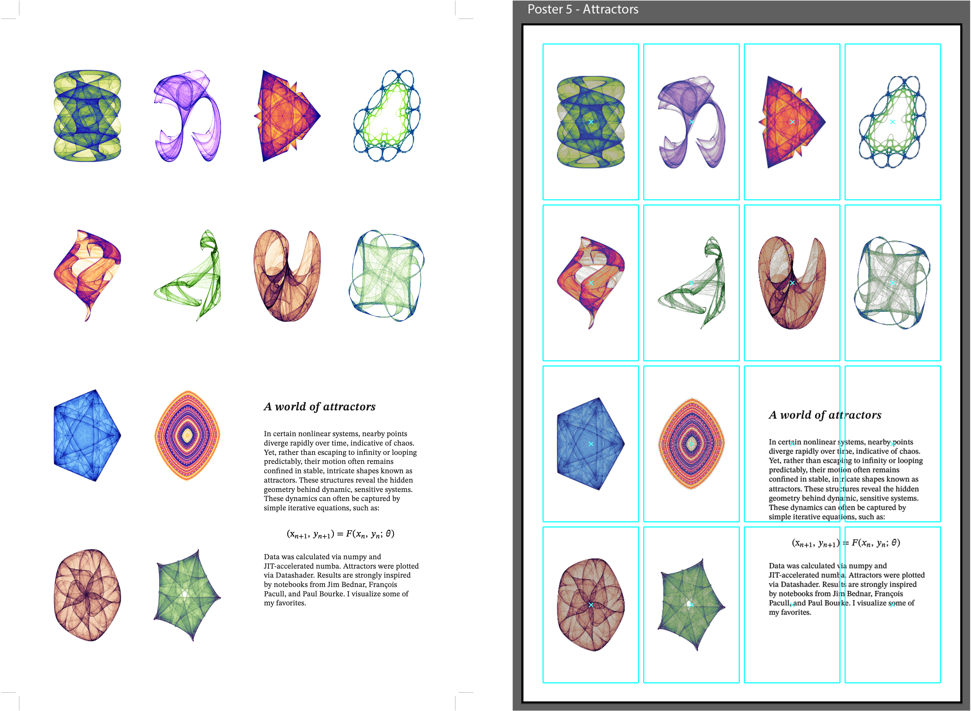 Attractors
I wanted this poster to be very minimal and very stark on the white background. So, I used this 4x4 grid. I used a sophisticated font, STIX Two Text, for the mathematical typesetting. I calculated and plotted each attractor using Numba + Datashader in Python (each sample is 100 million points). I picked my favorites and plotted them. The figures had to be embedded as rasters, as vectors would be way too much for Illustrator, even in Outline mode. Being white background on a white print, this poster also taught me about using trim marks in Illustrator. I also learned a little about the process of getting figures from Matplotlib/Datashader/Python to Illustrator (e.g. configs, DPI, etc.).
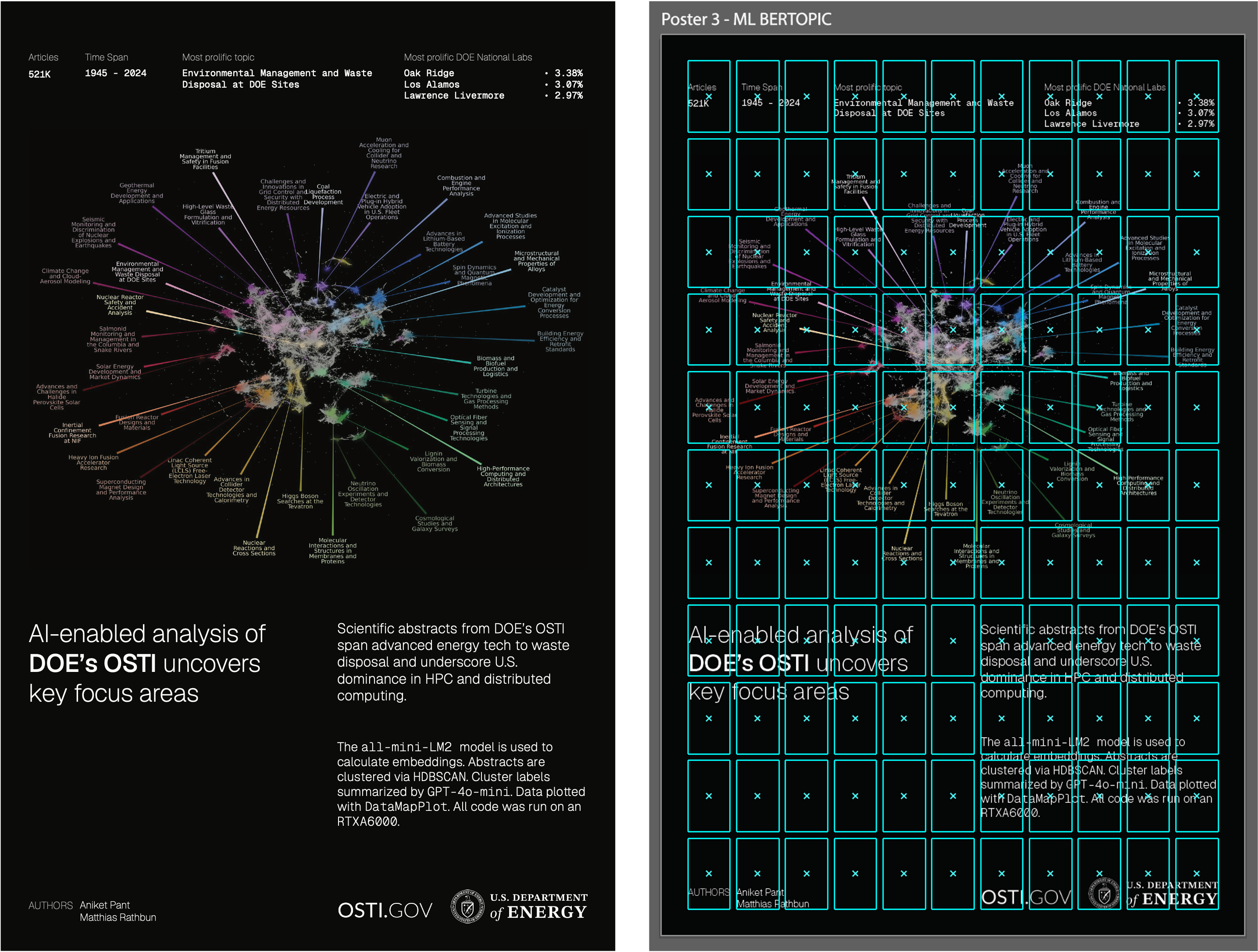 BERTopic
This poster had a much busier grid. First, I made the BERTopic map using a custom dataset of 521K scientific articles on DOE's OSTI repository. I used BERTopic, UMAP, and GPT-4o-mini for the labelling. To make the plot, I used DataMapPlot. For the text, I used Geist, which is the same font used by Vercel. Being able to make this map of so much DOE history was cool. Making this poster also led me to build Clusterfunk. It would've been cool to put something in the black space under "AI-enabled analysis of DOE OSTI...".
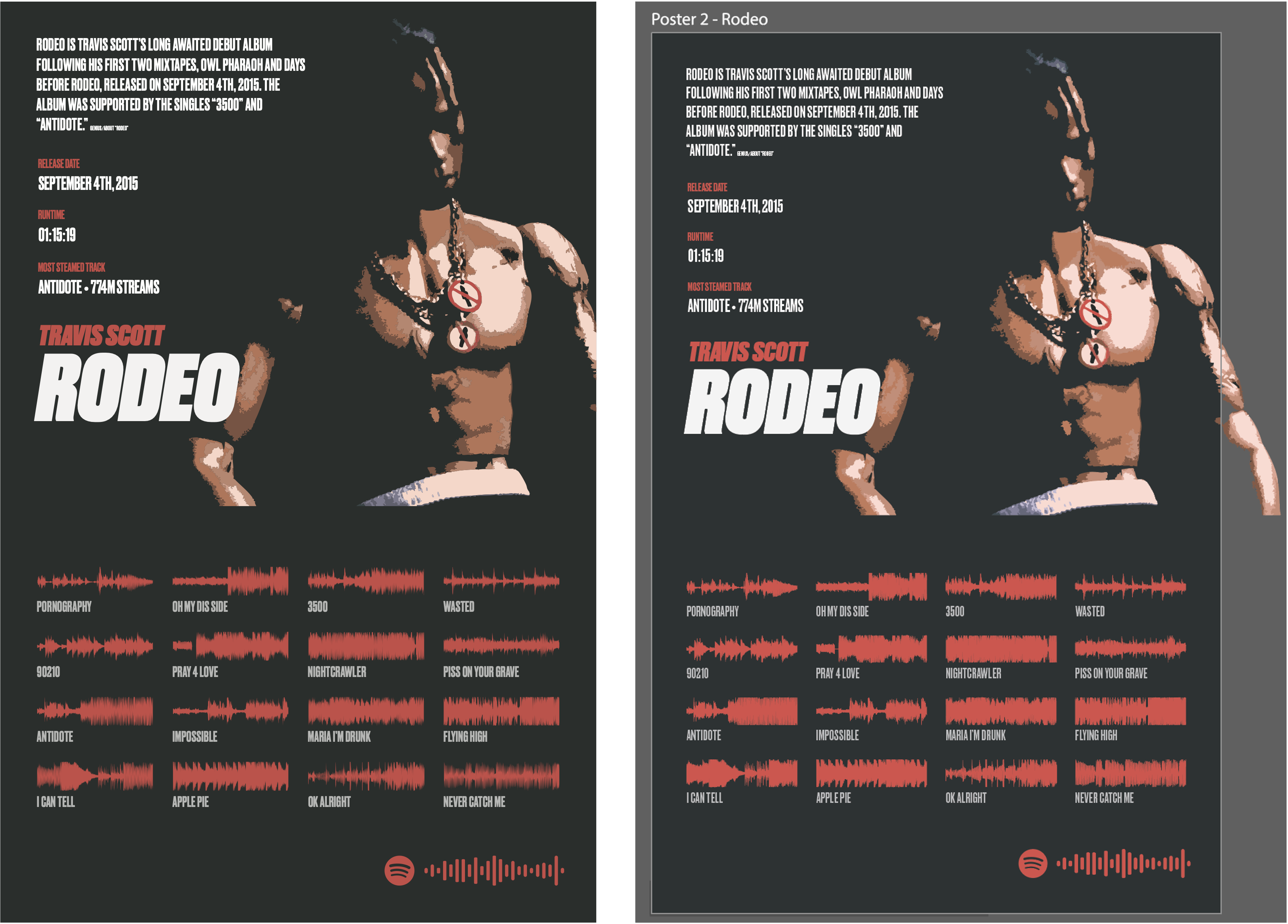 Rodeo
Rodeo
Rodeo, by Travis Scott, is my favorite album. September was the 10-year anniversary of this album. Designing this poster was a lot of fun. I used the "Druk" font. The red color was grabbed from the illustrated chain worn by the Travis Scott figurine. Using a copy of the HQ Rodeo dark logo, I did some color clustering to pull out 3-4 colors to make the figurine look closter to a cartoon. One key was making the braids a single color cluster, and blending them into the background. I really like how this came out; it looks like Travis is blending into darkness, evoking the same feelings many of the songs in Rodeo do.
To make the audio waveforms, I used Python (librosa + Matplotlib + some smoothing to export vectors). I made this poster before I learned about guides/grids in Illustrator, so that made this poster extra hard. Impossible is my favorite song. The Nightcrawler wavefrom shows how the whole song is a rollercoaster.
To make the SVG spotify code, I used an online tool.
I think this design process did make me enjoy each song more, become a bigger fan of some songs I don't often listen to, and overall have fun engaging with the album.
I printed each poster in 11 in x 17 in at the SCD Shop for approx ~1.50/poster. I cut and framed each poster, and they now decorate my previously bland apartment. The process of making each poster was very nice.
I am still very much a novice and I have a lot to learn, but I did enjoy research online resources on poster design (e.g. grids, Swiss design, etc.), and I hope to continue improving. Learning Illustrator was also very useful.